
Salesforce Reports and Dashboards are powerful tools that help businesses analyze data, track performance, and make informed decisions. Whether you’re a Salesforce admin, a business user, or a manager, understanding how to create and customize reports and dashboards is crucial for maximizing Salesforce’s potential.
In this blog post, we’ll cover:
-
Introduction to Salesforce Reports
-
Types of Reports in Salesforce
-
How to Create and Customize Reports
-
Introduction to Salesforce Dashboards
-
Building and Managing Dashboards
-
Best Practices for Reports and Dashboards
-
Advanced Tips and Tricks
1. Introduction to Salesforce Reports
Salesforce Reports allow users to extract, organize, and summarize data stored in Salesforce. They provide insights into sales performance, customer behavior, marketing campaigns, and more. Reports can be filtered, grouped, and formatted to meet specific business needs.
Reports in Salesforce are a collection of records that meet specific, defined criteria. These records are displayed in rows and columns and can be filtered, grouped, and summarized to gain insights.
Key Benefits of Salesforce Reports:
-
-
Real-time data analysis
-
Customizable views based on business requirements
-
Exportable in multiple formats (Excel, CSV, PDF)
-
Scheduled for automatic delivery
-
2. Types of Reports in Salesforce
Based on the requirements, records, and fields available, there are different report types in Salesforce. Every report that you build is based on a particular report type. The report type is selected first when you create a report. Every report type has a primary object and one or more related objects.
All these objects must be linked together either directly or indirectly. However, a report type cannot include more than four objects. Once a report is created, its report type cannot be changed. Let’s look at the types of reports in Salesforce.
There are two main types of reports in Salesforce: standard and custom. Both have different features and object fields.
1. Standard Report Types
Standard Report Types cannot be customized and automatically include standard and custom fields for each object within the report type. They get created when an object or relationship is created. Standard report types always have inner joins.
2. Custom Report Types
Custom report types are reporting templates created to streamline the reporting process. An administrator or a user with “Manage Custom Report Types” permission can make these reports. When standard report types cannot specify which records will be available on reports, a custom report is the go-to option.
In custom report types, you can identify objects that will be available in a particular report. The primary object must have a relationship with other objects present in a report type, either directly or indirectly. Object relationships that Custom Report Types support can:
-
- Include all records that have children.
- Include all records that may or may not have children.
Note:
-
- Once a report type is saved, its primary object can’t be changed.
- Suppose the primary object on a report type is a custom object, and the custom object is deleted. In that case, the report type and any reports created from it will also be automatically deleted.
- If you remove an object from a report type, all references to that object and its associated objects are automatically removed from reports and dashboards based on that type.
- After selecting the report type, we switch to the report builder to create a report.
Formats of Reports in Salesforce
Salesforce offers four main types of reports:
a. Tabular Reports
-
-
Simple, spreadsheet-like format
-
Best for generating lists (e.g., contact lists, opportunity lists)
-
b. Summary Reports
-
-
Similar to tabular reports but with grouping and subtotals
-
Useful for categorized data (e.g., sales by region)
-
c. Matrix Reports
-
-
Displays data in a grid with row and column groupings
-
Ideal for comparing data across multiple dimensions (e.g., sales by product and region)
-
d. Joined Reports
-
-
Combines multiple report blocks in a single view
-
Useful for comparing different datasets (e.g., leads vs. opportunities)
-
3. How to Create and Customize Reports
Steps to Create a Report:
-
-
Navigate to the Reports tab.
-
Click New Report.
-
Select the appropriate report type (e.g., Opportunities, Accounts).
-
Choose a report format (Tabular, Summary, Matrix, or Joined).
-
Add filters, groupings, and columns as needed.
-
Save and run the report.
-
Customization Options:
-
-
Filters: Narrow down data (e.g., date ranges, statuses).
-
Groupings: Organize data by categories (e.g., by sales rep, region).
-
Formulas: Add calculated fields for metrics.
-
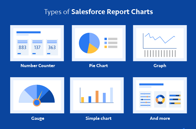
Charts: Visualize report data with bar, pie, or line charts.
-
4. Introduction to Salesforce Dashboards
Dashboards are visual representations of report data, displaying key metrics and trends through charts, tables, and gauges. Dashboards provide a quick overview of business performance.
Key Features of Dashboards:
-
-
Dynamic and interactive components
-
Auto-refreshing data
-
Drill-down capabilities for deeper insights
-
Customizable layouts
-
5. Building and Managing Dashboards
Dashboard Components
Each component is tied to a source report. Types include:
-
- Bar Charts
- Pie Charts
- Line Charts
- Funnel Charts
- Gauge Metrics
- Tables
Dynamic Dashboards
Dynamic dashboards show data according to the viewing user’s security settings. This allows one dashboard to serve multiple users with different data visibility.
Steps to Create a Dashboard:
-
-
Go to the Dashboards tab.
-
Click New Dashboard.
-
Enter a name and description.
-
Add components (charts, metrics, tables) from existing reports.
-
Arrange and resize components for optimal viewing.
-
Save and share the dashboard.
-
6. Best Practices for Reports and Dashboards
For Reports:
✔ Use meaningful names and descriptions.
✔ Apply appropriate filters to avoid data overload.
✔ Schedule reports for automated delivery.
✔ Optimize report performance by limiting fields.
For Dashboards:
✔ Keep it simple—focus on key metrics.
✔ Use consistent color schemes for better readability.
✔ Enable dynamic filters for user interactivity.
✔ Regularly update dashboards to reflect business changes.
Use Cases
-
- Sales: Track performance by rep, pipeline by stage, and win/loss ratio.
- Service: Monitor case resolution time and customer satisfaction.
- Marketing: Analyze campaign ROI and lead conversion rates.
7. Advanced Tips and Tricks
-
-
Dashboard Filters: Apply filters across multiple components for unified insights.
-
Historical Trending: Use reporting snapshots to track changes over time.
-
Embed Dashboards: Display them in Lightning pages or external websites.
-
Leverage Einstein Analytics: For AI-driven insights and predictive analytics.
-
Conclusion
Salesforce Reports and Dashboards turn raw data into actionable insights. Whether you’re an admin, executive, or team lead, mastering these tools can significantly improve strategic decisions and operational efficiency.
Stay ahead by continuously refining your reporting strategy, and explore new features released in Salesforce updates.
For more in-depth learning, check out these resources: